Directing the Website Viewer’s Attention
Negative space refers to the space surrounding the main subject/object in an image, picture or photograph. Artists have long known that negative space can make the subject stand out or get lost.
On the other hand, positive space refers to the space the subject/object occupies.
Achieving a balance between positive and negative space that is aesthetically pleasing is what graphic designers and artists typically aim for. Also, when marketing your product, there are main images and text that you want as the main focus. They should grab most of your viewer’s attention.
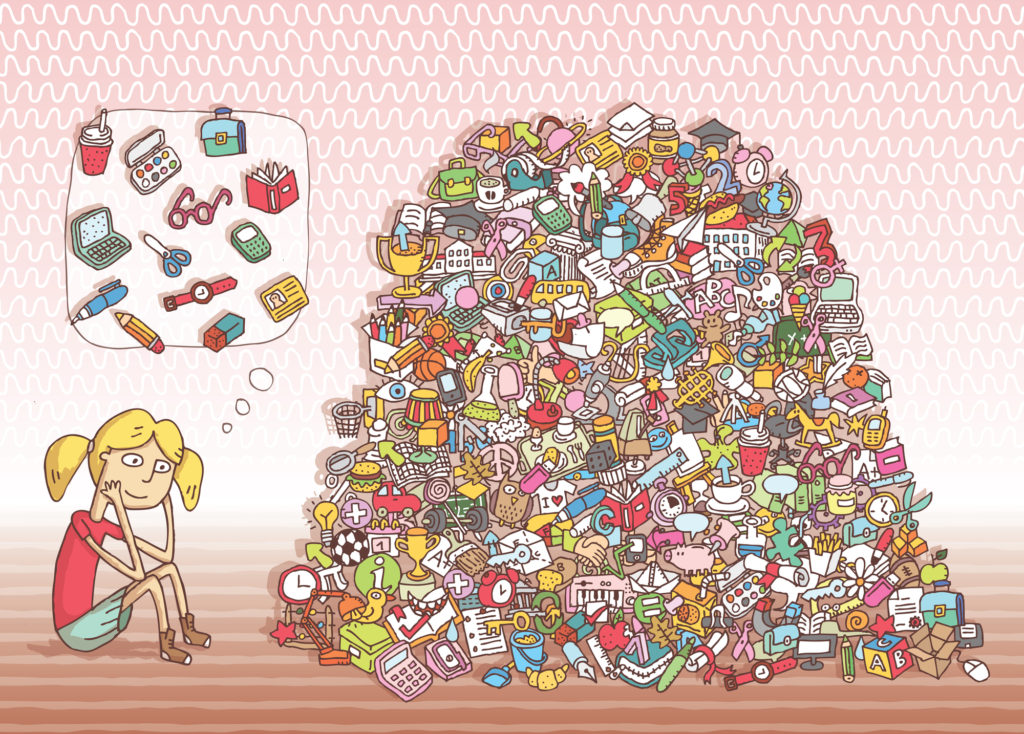
Positive Space to the Extreme
Some puzzles, such as the game “Where’s Waldo?” are great examples of positive space taken to the extreme. Below is an example where you can see how the items the girl is trying to find have gotten lost in the pile of objects occupying the positive space.
How Negative Space Can Create a Dramatic Effect that Draws Attention
In contrast, putting a solid dark background around the subject/object can make the object stand out and completely engage the viewer’s attention.
Here’s an example:

You can almost taste the chocolate and ice cream melting in your mouth.
Variation Can Break Up a Sea of Text
Have you ever opened up a website that was a sea of text? Paragraphs and paragraphs of text or long paragraphs with little to no variation are what we’re referring to here. The amount of text is overwhelming and sends viewers clicking away to other websites.
Through the use of different paragraph sizes, subheads, bullet points and varying fonts, interspaced with images and empty space you can transform a boring sea of text. The page can evoke emotions in the viewer that they will associate with the product.
Colors can also add variety that makes a design element stand out. The call to action “Contact Us” button created in a different accent color creates a contrast with other elements on the page and can jump out at the viewer.
How Cramming in a Few More Messages Can Ruin the Layout and Focus
All too often, clients want to cram in one more money making message. They see “wasted” space and want to be sure all of it is used. Unfortunately, when a boatload of messages hit a viewer all at once, viewers feel bombarded. They typically click away without grasping any of the messages. Hence the saying: “Sometimes less is more.”
There are times when viewers are looking for lots of information. For example, they bring up a newspaper, The New York Times. It’s jam packed with positive space, lots of text. However, even the New York Times has now added a header at the very top of the paper that makes use of negative space. When we brought up the site, that header had a center image with a black background showcasing the newspaper’s Logo and tagline that said, “The truth is worth it.”